
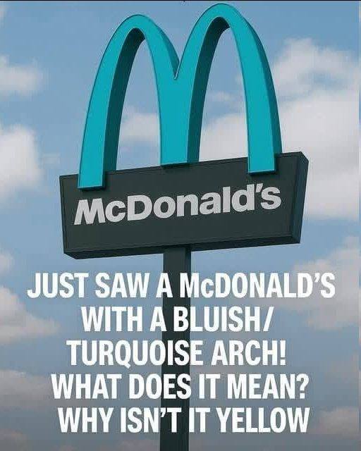
Why Turquoise?
The choice of turquoise was not arbitrary. It made sense on two levels. First, practically: turquoise and teal tones read as natural and complementary against the red rock and blue sky palette that defines Sedona's visual landscape, whereas yellow creates a jarring contrast that the eye immediately flags as out of place. Second, culturally: turquoise has deep roots in the Southwest and in the Native American traditions that have shaped Sedona's aesthetic identity for centuries. Walk through Sedona's shops and galleries and turquoise appears everywhere — in jewelry, in décor, in art. The color is woven into the visual fabric of the place in a way that makes it feel genuinely local rather than imposed.
The result is a McDonald's whose exterior is built in dusty red tones to echo the surrounding rock, with a turquoise M on the building and along the highway sign. Step inside and it is entirely conventional — the same menu, the same interior branding, the same Golden Arches in their standard yellow on the interior signage. Only the outside departs from the norm, which was precisely the point. The building was meant to belong to Sedona. Inside, it remains unmistakably McDonald's.
The Irony: It Became a Landmark Anyway
The original intent was for the turquoise arches to help the McDonald's disappear into its surroundings — to make it less visually intrusive, less of a commercial interruption in a natural landscape. The irony is that the opposite happened. The Sedona McDonald's has become one of the most photographed fast food restaurants in the world, a genuine tourist attraction that draws visitors specifically because of its unusual signage. People stop, get out of their cars, and photograph themselves with the turquoise M. It has been featured in travel guides, food media, and lists of the world's most unusual McDonald's locations. The building that was meant to blend in became the most distinctive McDonald's on earth precisely because of the modification intended to make it less noticeable.
