
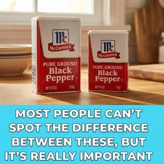
Watkins Inc., a respected spice company known for leaning heavily into clear packaging and minimalist design, publicly questioned the change. Their point wasn’t just about quantity; it was about presentation. Watkins argued that McCormick’s redesigned tins might create an impression of unchanged volume even though the product amount had been reduced. Because McCormick uses opaque tins, shoppers cannot see the pepper inside, relying entirely on the external shape and the printed weight.
McCormick responded firmly. They emphasized that every container displays the net weight clearly, meeting all regulatory requirements. From their perspective, no deception exists because the information is there — printed plainly, consistent with
Watkins, however, maintains that visual context matters just as much as printed information. Their products sit on shelves in transparent containers, making it easy for customers to see exactly how much they’re getting. When two brands appear side by side — one opaque and larger, the other smaller but full — it’s not hard to imagine how confusion could arise. They argue that packaging design itself plays a crucial role in shaping expectations, whether companies admit it or not.
